You should consider the fundamentals of user interface design if you’re making a website or app for your business. You should pay close attention to the colors you choose.
Color selection is important. Each one inspires some distinct vision or emotion in individuals who see it. You can use that in design. Let’s discuss how to design a user interface that fully utilizes color selection. It’s one of those guidelines for user interface design that ought to increase your revenue.
Why Colors Must Be Used Properly in Your Website UI

Colors have just as much ability to communicate as words do. These may exhibit your brand’s personality. They can draw users and more effectively convey your message. Any UI Design standards are likely to make frequent mention of colors.
A brand’s or product’s primary mood, tone, concept, and connotation can be established through color. Users evaluate the quality of online purchases in roughly 90 seconds, according to research from the Institute for Color. People’s perceptions of products are subconsciously impacted by color in anywhere between 62% and 90% of cases. It follows that you should never pick the right colors for your brand, logo, and product packaging at random.
A UX color palette can be used to improve user experience. Better information readability is always supported by choosing the proper colors. Moreover, it can be used to strengthen certain components, such as calls to action. That might improve customers’ ability to navigate. It can satisfy a user’s irrational aesthetic requirements. Finally, it can encourage natural interactions.
So, the color of the language might also affect the decision to buy. Today, any internet marketing strategy must include color as a key component.
UI Colors Fundamentals

Each UX color selection comes with a certain meaning and connotation. Of course, some of that depends on culture.
Choose the Right Color in the Proper Pattern
Various colors used in UI design communicate different ideas to the senses. Ideally, you want to make the appropriate decision in the ideal circumstances. They must be directed at the right audiences, and you should pick them to focus on the right objectives.
If you want to use color in UI design effectively, you must first grasp what each hue means and how it affects your clients’ emotions and behavior.
Starting with the feelings that colors can evoke and the variations in how they are perceived:
- The color red is what we refer to as a warm color. Yellow, orange, and red would be those colors. Warmth and comfort-related feelings are evoked by these hues. To some people, they may also connote rage, animosity, or passion. Coca-Cola is undoubtedly a well-known brand that employs red as its primary corporate color to evoke feelings of warmth and comfort.
- Blue, green, indigo, and violet are cool hues. There are several associations there, like sweetness, stillness, confidence, trust, or contemplation. You may have noticed that blue is a hue that many technology companies like Skype, IBM, Dell, HP, and Intel frequently employ to help build customer trust.
- Gender differences exist in how each perceives color. According to Natalia Khouw’s study on “The Significance of Color for Gender,” men like the color grey, white, or black more than women do. Women also pay more attention to the color combinations of red and blue and are more easily confused and distracted than men. That is why companies like Mercedes, whose primary target market is men, design websites using a combination of the hues black, grey, and white.
- It has also been established that adults favored the color combination of red and blue the most. By employing these hues as brand colors, Pepsi gains an edge.
When creating the interface for your product, keep in mind the following color meanings.
- Red can represent both happy and unhappy emotions. Some of those include the previously mentioned Coca-attempts Cola’s to evoke rage, love, confidence, and passion.
- Most people tend to become excited when they see an orange. It’s one of the excellent UI colors that many businesses employ. As an illustration, Fanta uses it as a background color to draw attention to the brand name.
- Yellow frequently represents sunshine, joy, and happiness. That’s why Snapchat utilizes this color in its logo when referring to social networking platforms.
- Blue denotes safety, security, and confidence. Several studies demonstrate that blue has good associations with a wide range of demographic groups. Everywhere you look, including many natural surroundings, is blue. It is included by hundreds of well-known firms, including the ones mentioned above as well as Skype and Microsoft Word.
- Green promotes sentiments of regeneration and peace. These feelings go nicely with a company like Tropicana, whose primary logo hue is green.
- Black often connotes mystery, but it also frequently connotes tragedy and death. It can also refer to something classic or modern.
- White typically connotes health, clarity, innocence, and purity.
- The jewelry company Asprey utilizes the hue purple in its palette because it frequently conjures up images of luxury and monarchy.
Here are some suggestions for selecting the ideal color palette for your UX/UI design:
- Similar UI Color Schemes: This phrase describes groups of colors that are close to one another on the color wheel. Saturation and brightness shifts are frequent sources of variation in comparable schemes. They perform better than significant color shifts.
- Complimentary UI Color Schemes: This choice is based on how complementary warm and cool colors interact with one another. They perform best when positioned opposite one another on color wheels. There are some useful tools for this strategy, including Check My Color, Coolors.co, and Paletton.
Bonus Tip:
Before adding color, designing in grayscale can greatly simplify a complex visual aspect. It demands a layout of the components and a renewed emphasis on spacing when you do so. After some workshopping, you can choose a single brand color to start with. Next, pick more candidates that would be appropriate.
Brand Personality Matched with the Right Color
Every brand has a personality. While selecting your color scheme, give careful consideration to yours. You cannot choose colors that contradict the message you’re trying to express if you want consumers to identify with your brand.
According to research, up to 85% of consumers believe that color plays the biggest role in their decision to buy a particular product.
Great companies don’t just happen to use the same color palette. Consider the recognizable red-and-yellow golden arches of the McDonald’s restaurant chain. While the red gently remind customers of the beef hamburgers that are offered inside, the yellow conjures up feelings of happiness and the sun.
Home Depot would be another illustration. We already highlighted how many people are excited by the color orange. Customers may find cutting-edge technology inside Home Depot, such as top-of-the-line gas grills or riding lawnmowers, thanks to the company’s straightforward orange and white logo.
Before deciding on color schemes, consider the brand personality. Consider the gender of the clients who use your items the most. Think about the message you want to deliver, the value you are offering, and how long you have been in the company. Do you want to come across as modern and exciting or established and trustworthy?
You are making every effort to comprehend your target market and the goods you will be promoting to them. You will have a higher chance of choosing the hue that will eventually become associated with your company if you can accomplish that. Your goal should be a straightforward user interface with sensible color choices.
Colors Balance
Keep the following in mind as you think about colors, advice on how to utilize them, and balance them. Making a total break from color schemes while designing UI interfaces is a mistake. Keep your design simple and clutter-free, and keep in mind that UI minimalism is always preferable. The next two rules ought to be helpful.
The first is 6:3:1, widely known as the “Golden Rule” of color selection. For finding balance with your color choice, the 60% + 30% + 10% rule is the best proportion.
When attempting to create a tidy and pleasing interface, this criterion is ideal. The tactic will lure potential clients if used correctly. The viewer’s eye will be made easier. They are able to flow smoothly from one area of your design to another.
Three primary colors maximum is the second rule. This one is a great approach to keep the image from becoming too cluttered. It allows you to keep balance, especially when you combine it with the Golden Rule. For instance, try this for a logo:
- A neutral color for 60% of your design
- A secondary brand color for 30%
- 10% in your UI design should be your main brand color
Both of these guidelines are used in good user interface design.
Here is an example of a website design from Amazon that makes use of three major colors: yellow for buttons and star ratings, blue for the footer and header, and white for the backdrop, which makes up 10% of the design.
In this section below, I have observed multiple occurrences of texts being highlighted. Why is this?

Combinations and Complimentary Colors
The following elements should be taken into account when creating a unified color scheme and a simple interface.
- Shades, Tints, and Tones
Shadows are excellent clues for getting the human brain to think in specific ways. If you make use of them, you have a better chance of acquiring clients. Use shadow to discreetly enhance the key components of your design.
To make variations using the color wheel, hues are required. You will get a tint if you decide to add white. If you want a shade, you can also add black, and if you want a tone, grey.
- Brightness
Boost saturation and reduce brightness to produce dark color variations. You must act in the opposite manner if brighter color variants will serve your goods better.
- Contrast
Another UI design technique that is seen as practical is contrast. This is the approach you would take if you were attempting to design a straightforward UI. It’s a simple technique to get users to feel something.
The most pronounced contrast is always produced by colors that are directly opposite one another on the color wheel. Consider how black and white seem when placed next to one another. High contrast makes the viewer focus and gives a sense of tension. Feelings of pleasure and comfort are evoked by light contrast. If you want to create a relaxed, casual design, use these.
Saturation Overload Kills Color Vibrancy
If vibrancy is your goal, color saturation is what you need to pay attention to. Yet, a color scheme built entirely of intensely saturated hues overwhelms the eye, which results in less vibrancy rather than more.
Less is typically more when it comes to color. When combined with less saturated colors that are successfully employed in the Instagram logo, a highly saturated hue will appear lively.
Define Interactive Colors
If you want interactive features, the best option is interactive colors. They could be buttons, links, or any other UI elements that users can tap or click.
If at all possible, limit your usage of color for primary interactions to just one. The user will begin to associate that color with one thing.
You may create interactive colors in both dark and light variations. You may indicate several states for UI elements using shades. Examples include the pressed or hover states.
Define Denotative Colors
Colors with denotation have significance. You must create a color scheme for each state on your app or website, such as warning, success, and error. The colors red, black, and green are the most frequently utilized for these uses.
Let’s say red is one of your brand’s colors. Then refrain from using that for error messages. Make sure the color you chose for a disabled state has enough contrast before choosing it. It must be readable by users.
Accessibility
Keep in mind the level of design accessibility of your color palettes and their contrast level when selecting the appropriate color for your UI toolkit. It makes it easier for customers who are color-blind to use your products. Use contrast checkers and design elements accessibility checkers like WebAIM, noCoffee, and Accessibility Scanner to make sure your color scheme is accessible. Never forget that creating an interface that is user-friendly is the main goal.
When developing user interface elements, the contrast and color schemes chosen can have a significant impact on how accessible they are to all end users. The use of your product by those who are color-blind is restricted if you only employ color distinctions. It is more accessible for people with vision impairments when light and dark colors are used in combination with methods like cross-hatching to distinguish distinct parts of the interface. This design mindset can lead to interfaces that are more engaging and practical for all of your users.
Inspiration from Art and Nature
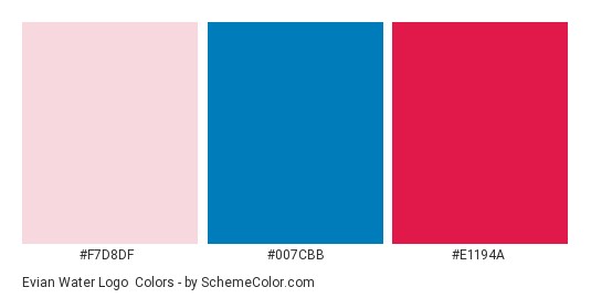
You would be wise to consider sources like nature and art for color inspiration in UI designs. Take a look at the grass outside and note the many colors of green, for instance. Colors that appear natural are popular. They feel approachable to users. One could consider art to be a direct mirror of nature. You can use it as inspiration because of this. The logo for the Evian brand, which employs both natural colors and natural design in its logo, can serve as an example.

By this point, it should be clear how important color is to UI design. Never choose your brand’s colors at random. A user interface with carefully chosen colors has the finest overall aesthetic.
Wrapping up
When going live with something like a website or a new corporate logo, it never hurts to test out color schemes and get feedback from potential clients. There is no reason why your brand can’t succeed at a higher level if you adhere to the best principles for using colors in UI design that we have already discussed.


