The internet has been a platform for human culture and all forms of consumption, from information to products to services. It is essential to be online to find information about a company, product, service, or person.
All these small businesses showcasing activities are centered around a website. Websites are a resource for information and a way to communicate. Small businesses often create websites to increase their online presence as well as to provide customers with a place to learn more about their products.
The design of a website is what a customer first notices. An excellent website design can make a good first impression and help you build a relationship.
WHAT IMPACTS WEBSITE DESIGN ON POTENTIAL CUSTOMERS
A good number of small business owners have not yet mastered the most recent technologies, even in 2020. According to surveys, more than a third (33%) of small business owners receive less than 5% of their customers through their website.
Start with changes in the design of your small business website to increase its effectiveness and convert more customers.
You will learn seven conversion-enhancing design strategies by the end of this article.
These are seven tips to create a better customer experience via design.
Read More: Reno Web Designer
1. Use the RIGHT COLOURS
Your website design can be made or broken by the use of colour. However, it doesn’t matter what message you want to send, limit the amount of colors used. A design with too many colors can look unprofessional and messy, which could leave a negative impression on your customers.
These are some of the things to keep in mind when choosing colors for branding or design. You can communicate your message better through design by understanding the values attached to each color.
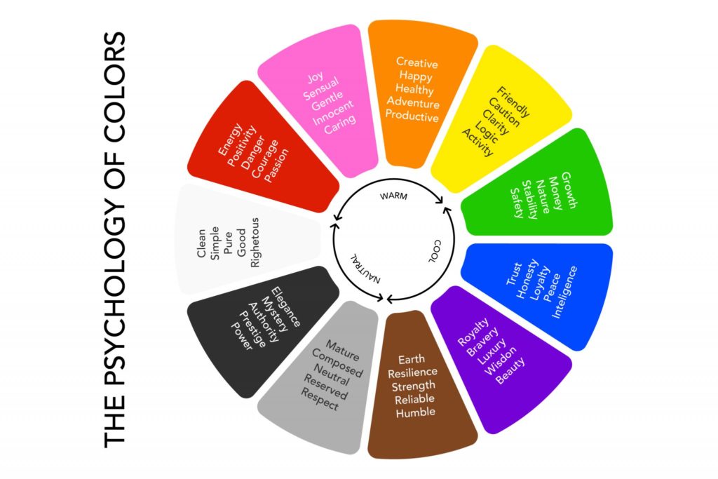
Compare the colors you use on your website. Compare the colors to the chart above. Do you send the right message with the right colors?
You must identify your target customers as a small business owner. Who will see the brochure or web page? Consider your age, gender and whereabouts.
Experts believe that warm colors can create a pop effect. One warm color is sufficient, but not more than two. It should be used only in the most important areas of your webpage. Examples: Unique selling points and calls-to action. Your small business website should use neutral colours as backgrounds, borders and fonts.
2. PICK A MINIMALIST LAYOUT
Website visitors prefer to scan pages than to read them. To find what they are looking for, they will often scan pages for keywords and phrases.
Remove excessive clutter. Every web page should serve a specific purpose. You should design the page to fulfill that purpose and eliminate any text, images or videos. Many website design platforms offer minimalist options.
Contact us today if you are looking for someone to design, build, and host your small business website for a ridiculously low $30 per month.
3. READABLE FONTS ARE USEABLE
Your website’s primary purpose is to provide information to search engines and users. Search engines can read text in any font but users cannot. Make sure that you use legible fonts throughout your website.
Your headlines must be prominent. Each headline should be larger than the text on your website. You can also add colour to headlines to make them stand out.
Use a font that is easily readable.
Use 14-18 point fonts on your web page’s body and 16+ points fonts for your headlines.
Keep the body font neutral. For the body, use greyscale colour schemes and not more than two tones of grey.
4. DESIGN CTA BUTTONS WITH HIGH IMPACT
The button design falls under the call-to-action design (CTA).
CTA stands for Call-to-Action. It is a text piece that encourages potential customers to act. Use benefit-oriented language when you use CTA buttons.
Consider the needs of your customer. If they do take the action, what’s in it? Place a prominent CTA button above the fold.
The fold refers to the parts of a webpage that visitors don’t see at first when it loads. To see the whole page, a typical web page requires that a user scrolls up and down. Jakob Nielsen says only 20% read below the fold. You can still add a button to your page at the bottom of your page. Sometimes, beautiful copy can make a difference.
5. HIGH DEFINITION IMAGES ARE USEN
Use only high-quality images on your website. Each year, screen definition improves. Get rid of grainy photos and replace them by high-quality ones. This applies especially to hero photos above the fold banner or any other images that take up the entire screen. High resolution screens can make poor quality photos look terrible.
6. ADD VIDEOS TO ENHANCE DESIGN
A great place to upload a video is the homepage. It is important to ensure that the video is correctly aligned. Remember to reduce the text content when adding video to a webpage. Instead, let the video do the work. It allows users to view the video without interruptions.
7. TESTIMONIAL DESIGN
Your Testimonials should not exceed three sentences. Consider the space where you intend to place them. What is the space available? How can you reduce the length of your testimonial to just one sentence? It will have greater impact. A font size of 14-16 points is recommended. Never make a fake testimonial. You can use testimonials to address buyers’ concerns.
HOW DO YOU MAINTAIN A SMALL BUSINESS WEBSITE?
These seven design tips should not be ignored. It takes perseverance to maintain a professional small-business website. To test how each design change affects your visitors, you can start with A/B testing.